Powered By Blogger

Wednesday, July 23, 2014

Black and Turquoise Artist Trading Block

Hi everyone! Melissa here with my take on our artist trading block.  

I painted my block with white gesso, then black acrylic, then a coat of glossy accents.

  I felt that the chipboard and doilies I put on the block perfectly complemented the theme, and era of the images.

I painted all the chipboard with gesso, then turquoise Viva Color Precious Metal Effects. I didn't need gesso on the doilies,and I also painted them in turquoise. On some chipboard I added a little bronze paint,  stickles, green Lumieres, and/or diamond glaze coating.  I embellished my block with images, bling, metal, feathers, beads, moss, pearls, and lace.

Thanks for looking!


Chipboard used:


Other products used:
Folk Art black acrylic paint
Viva Color Precious Metal Effect Paint in turquoise, and bronze
Jaquard Lumieres in green
black ink
Graphic 45 paper
Tim Holtz metal
Judy Kins Diamond Glaze
Glossy Accents
Jolee's Bling
Ranger Liquid Pearls
Jaquard Mica powder
Feathers, seed beads, bling , flower, and chain from my stash


Wednesday, July 16, 2014

A Winter's Day In Sverige

Hi everyone! Melissa here with  a 12x12 layout using Gina's Lasercut Chipboard.

I took one of Gina's chipboard oval frames, and used part of it. I thought the swirls and curves suited the quiet mood of the photo.  This is a cousin of mine in Sweden, with his girlfriend.

 I painted  it with gesso, then  Viva Colour Precious Metal Effect Paint. I blended the edges of turquoise and mother of pearl colors together. When that dried,  I put a layer of green watercolor on top. I coated that with Diamond Glaze.  I went over the edges with black acrylic paint. 

Who doesn't like butterflies?  I painted this beautiful chipboard with gesso, then texture paste.  I then painted it with turquoise metal color, followed by a layer of green watercolor. I rubbed on some bronze lumiere paint to pick up the texture. I put a little perfect pearls on top. 

The little silver corset on the right is Marvy Decocolor silver ink over gesso.  I used a needle and black thread to lace it.


Gina's Designs chipboard used:


Other products used:
7 Dots paper
Fairy Belle paper and grey flower by Prima
Turquoise flower  by Petaloo
Viva Colour Precious Metal Effect Paint in turquoise, and mother of pearl
Winton and Lewis Watercolors
Vintaj patina paint
Tim Holtz metal, and rub-ons
Marvy Decocolor paint marker in silver
Stampendous silver glass glitter
Stickles
Viva modeling cream, in pearl
Tsuineko chalk ink
Ranger Perfect Pearls 
Judy Kins Diamond Glaze
Vintage clear glass glitter
Distress Stickles


The brown splotches are watercolors, theyre all over the page. I also used them to paint the edges of the top paper. On top of the brown I put vintaj patina paint, and also  bronze lumieres. If you look closely you can see blue glitter sprinkled on, and some mica fragments by Stampendous. 


To explain more about the chipboard above the photo: some areas are painted with white, and some with blue. This paint dries pretty fast so I had to work fast, and put it on kind of thick. Thick because it dries slower if there's more of it.I blended the areas of  the different colors into each other.  I used a few coats in areas just experimenting til I got the look I wanted. I used a bit of crayola glitter glue, and also some bronze lumieres, after the Diamond Glaze by Judy Kins was dry. Glossy accents would work just as well, and so would Mod Podge Dimensional Glaze.

To make the glitter border on the edge of the blue ppr under the pic: silver stickles, let dry, diamond stickles, while wet,sprinkle on antique silver glass glitter, and clear glass seed beads. Let it all dry. Brush a little bronze lumiere on top. 

I made the green frame thing with a brass template and texture paste. I dry brushed silver ink on all over,, then green vintaj patina, and rubbed a little bronze lumieres on top. I also painted with brown watercolor, let it puddle between all the ridges, then dabbed it off with a ppr towel.  This left enough paint to give the raised paste more definition. I drew inside the ridges with a black ballpoint pen.
Under the photo you can see I puddled brown watercolor over the clear glass glitter.


Wednesday, July 9, 2014

Two Bird and Butterfly Cards

Hi everyone!  Melissa here with two cards using Gina's Lasercut Chipboard.

I love these very elegant flourishes.  I used them as tree branches in my design.
I first painted the flourishes with gesso. I mixed green and brown watercolors, and dabbed on a little green chalk ink to paint them.  I used a small paintbrush and water to  take off  a little paint from the centers.  I put a bit of white paint on and them and  blended it with the edges of the green.

I started by painting the birds with gesso, I used birds from Botanical Tea papers as inspiration for the colors. I penciled in some lines to separate top from bottom.   I put a little of pink and  brown on the the top. On the bottom  I used a little blue, and a little green.

On the heart I used gesso followed by pearl Viva Decor paste.


Gina's Designs chipboard used:


Other products used:
Prima Fairy Belle paper
Tiny pieces of Prima Nature Girl and Botanical Tea papers
Dried moss, and lichens from my yard
Vintaj butterfly and bead caps
Prima flowers


Wednesday, July 2, 2014

An Altered Box and Charm

Hi everyone!  Melissa here with an altered box using an interesting technique and Gina's Designs Lasercuts.  I first noticed this amazing technique using fusible film (iridescent packaging wrap) on Pinterest, and I thought it would be fun to try it. Here's the link for the tutorial  . Click on the word "tutorial".

 I began by coating the box with gesso.  I then hand painted three peacock feather shapes on the top of the box  using three Viva Decor Metallic Colors. On the sides and bottom I just painted randomly in the same color paints. 

I then followed a tutorial using fusible film.  After I did all the steps in the tutorial,  except for soaking the whole top in alcohol, I put small amounts of paint in different colors on top. I dry brushed a lot of the ridges with turquoise paint, and Marvy Uchida gold ink. I put the gold ink around the top edges.  The very deep blue purple color on top I made by mixing turquoise and purple together.

 The ridges were made by the layers of the crumpled film melting together.  I wanted the paint underneath the film to show more on the rest of the box.  To do this I put on a layer of film that was only wrinkled slightly on the sides and the bottom.  I didn't put any paint on those parts.
On the chipboard,  I first painted with gesso, then embossed in gold.  I put Mod Podge Dimensional Magic on top, then a little gold leaf, and then I covered it all with gold opaque paint marker. 

The wooden charm I first painted with gesso, then turquoise Viva Decor paint.  I put the key on, then covered the paint with Dimensional Magic. Thanks for looking!


Gina's Designs products used:


Other:

Wood Box from Hobby Lobby
Iridescent packaging wrap
Acrylic Medium
Viva Decor Precious Metal Paints in bronze, turquoise,and purple
Jaquard Lumieres acrylic paint
Ranger alcohol inks
Embossing Powder
Mica powder
Marvy Uchida Deco Color Liquid Opaque Marker in gold and silver
Tim Holtz metal feet, pen nib, and Chit Chat sticker
Small pewter bird and key from Vintaj
bicones and flat back crystals from Swarovski

This is how it looks from the back,and in the sun.


Another view in the sun.

It is blingy.

It looks so different in the shade, but you can see more detail.
The light blue and the pink are definitely from the wrapping paper. A lot of the green too.

No paint at all on this paper. You can see the turquoise paint underneath though.


This is on my glass table in my backyard.

Wednesday, June 25, 2014

ATC Shrine with ATC

Hi everyone! Melissa here with an ATC shrine by Gina's Designs Lasercuts, and an ATC to go inside.

  I started by coating the shrine's pieces with a few coats of gesso before I put it together.  I was careful to not get any gesso on the tabs on the hardboard,so that they would fit correctly.   When dry I assembled it ,then painted with  Precious Metal Colours in blue I dry brushed on a little bronze. Dry brushing is when you put a small amount of paint on a dry brush.You can add just a little color to bring out texture in anything.

 Then I poured on alcohol ink in a thin lines in purple. As quickly as possible, I wiped it off.  I did the same thing using yellow. The ink made some areas green,  took some of the sheen off ,and added some purple. I really liked the effect it made.

 I put a little more blue on in different area.  The leaves on the front are green liquid pearls, then green lumieres ,with more bronze and blue on top . To get it lighter on the inside I put on a little pearl colored paint,and some gold leaf on glossy accents .Thanks for looking!


Atc Shrine by Gina's Designs Lasercuts


Other Products used:
Viva Decor Precious Metal Color in turquoise, mother of pearl, and bronze
Ranger alcohol ink in purple twilight, and sunshine yellow
Gel pens
Marvy Uchida DecoColor  Liquid Silver Opaque Paint Marker in gold and silver
 Swarovski crystals
Memory glass by Ranger
Tim Holtz metal
gold leaf
metal frog prince
watercolor paper
Winton and Lewis watercolors


 I didnt have yellow microbeads . I put alcohol ink on clear ones.  I needed to add some yellow into the Atc for my friend Denise.  She's an LSU fan and those are the colors . Purple and gold.
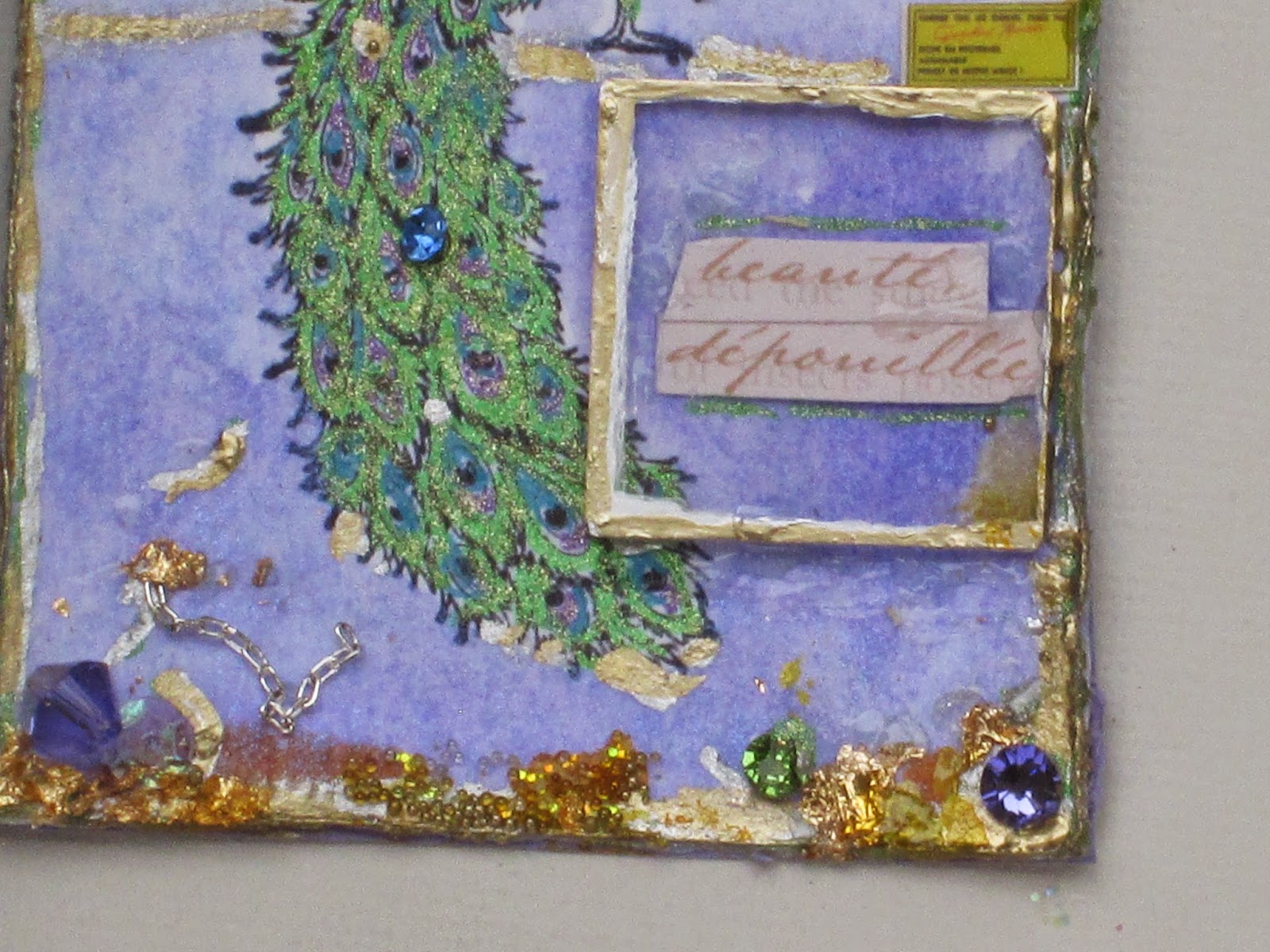
Some more yellow is in the tiny yellow rectangle above the memory glass. That's from Susan Lenart Kazmer's Image Pack, its on the front cover, along with tiny pictures of the rest of the images in the pack.
The words under the glass say pure beauty. My way of saying how beautiful nature is.


a couple of these are blurry , its cloudy out today,so there's not a lot of light.

I took these photos a few days ago   You can see how the colors look different in the sun. I put gold leaf on the dragonfly.

Wednesday, June 18, 2014

Bodie

Hi everyone. Melissa here with a 12x12 layout using Gina's Designs Lasercuts.This photo is taken in the ghost town of Bodie, California . Bodie produced more than $35 million in gold and silver.

 My Father-In-Law passed away on May 28th.  This is a tribute page about him that I made for my husband, Rich.  I am going to put it into a scrapbook frame for him to put in his study here at home.   Rich picked out the photo , it's his favorite one of the two of them.

Everything on the page is symbolic of Einar and his interests in life. There is hidden journaling written on canvas on a tag.  The images are from Swedish wrapping paper I've saved from Christmas gifts from him.

To prepare the chipboard, I painted them with gesso. On the compass I put on Viva Decor Precious Metal Color in bronze.  I painted a lot of the edges with black acrylic paint.  I applied Mod Podge Dimensional Magic, and sprinkled on a little clear glass glitter while it was wet.  The lobster is red glitter poured on wet glossy accents. The rest of the chipboard  was painted with lumieres, some were over texture paste, with the gloss on top. I used embossing powder on the hammer, and saw,then gloss. On the ships wheel I embossed with gold, then put on a bit of brown ink, followed by a coat of gloss.
Thanks for looking.


Chipboard used:


Other products used:

Papers by UHK gallery, Winter is Coming
Winton and Lewis Watercolors
Viva Decor Precious Metal Colour
Alphas, metal corner by Jim Holtz
Mod Podge Dimensional Magic
Lumieres,acrylic paint by Jaquard

Here are close ups in the sun, and then in the shade.  I wanted to show the chipboard and the wrapping paper images in more detail than the above photo.


Going clockwise with a description of what the chipboard and other things stand for :

The cross,at the upper right, for Einar's love of God. He was very active in his church.

The lobster,  stands for crayfish . The Swedes celebrate midsummer with crayfish as part of the meal for the day.  Einar prepared this meal in his home in Northport, New York.

The wrapping paper stands for Einar's love of Christmas. The house would be decorated with lots of Swedish things. He would bake traditional cookies and rolls.  He and Stella, his wife , would make both traditional Swedish and English meals. Stella grew up in Devon, Cornwall.

I wrote in ink on the canvas tag, so that 100 years from now, if this page is still around, and it crumbles at the touch, the canvas will not.  It has a list of Einar's interests, and he had a lot!


Einar had a telephone from the 1920's in his study.  The coin is from Iceland, during a trip to there in 2002. We also went to Denmark, and Sweden , the five  of us :  Einar, Stella, Rich, Nick, and I.    The small hammer under the phone stands for Einar's woodworking . He made furniture,  a dollhouse, a humidor, lots of seasonal decorations, and smaller items he sold and gave as gifts .


 In 1990 the four of us, my son Nick wasnt born yet, took a trip from our home in Auburn , California, to Bodie,Mono Lake, and Yosemite. I think it took 3 or 4 hours to get there., although it says Bodie is 135 miles from Auburn. It was kind of a scary drive from Bodie to Yosemite,with lots of twisting highway and sheer drops at the side of the road..  Bodie is over 8000 ft in elevation ,so it was cool, even in June, when we went.
The small hammer under the phone stands for Einar's woodworking . He made furniture,  a dollhouse, a humidor, lots of seasonal decorations, and smaller items he sold and gave as gifts .
Einar had a big interest in cars, and always asked for a Rolls Royce for Christmas when my husband Rich would ask him what he wanted.
The saw under the photo is also for woodworking.  Under the car is part of a book image I cut in half and tucked in. Einar read constantly about many different subjects, fiction and non-fiction.
The ship's wheel is for the two sailboats he had over the years.
The delphinium and small daisy are from a bouquet at the visitation the day before his funeral.
There's a little of the Swedish flag in blue and yellow. And a wrench to stand for all the home repairs Einar did. He also put in an apartment connected to his home that included a kitchen ,bath, a fireplace, parquet floors, and built in bookcases at the side of the windows .
The compass is for Einar's love of travel.


I also took a set of close ups in the shade.  You can see a prong next to the wrench.  Einar loved to garden. He grew vegetables of all kinds, and lots of flowers.  He built a beautiful arbor in the front to grow red roses on.  Many years before that he put in a deck and a structure over it to grow grapevines on,in the back of the house.


The little door at the lower left says home on.  Einar dearly loved his family and home.  He loved nothing more than having his wife,his three beautiful children, their spouses, and eight grandchildren, around him at Christmas. He will be very missed.

This is hard to see so I did a x16 close up. It has a little boy yule tomte (they are  Scandinavian mythological creatures typically associated with the winter solistice, and Christmas ) holding a lantern so the older yul tomte can shoe the horse.