Powered By Blogger

Friday, August 29, 2014

Northport, for Reneabouquets Shop

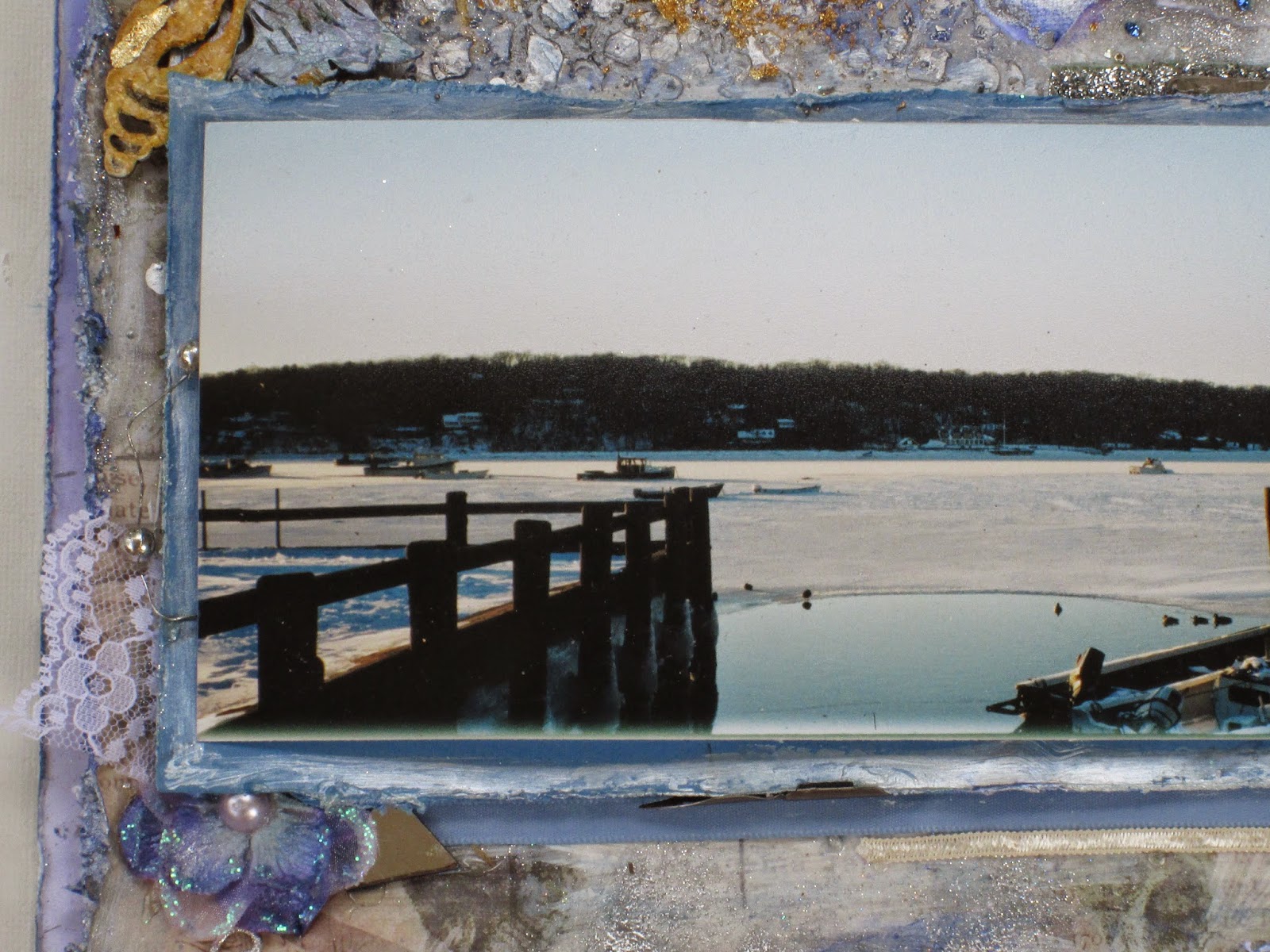
This is the town where my husband grew up.

My Mom-in-Law took this photo.

Renea asked me to guest design for her for September.  I think the butterfly looks beautiful here with its glitter, and delicate colors.


This is the same view but in direct sunlight, which shows the bling more.

 The chipboard is from Gina's Designs.


Wednesday, August 27, 2014

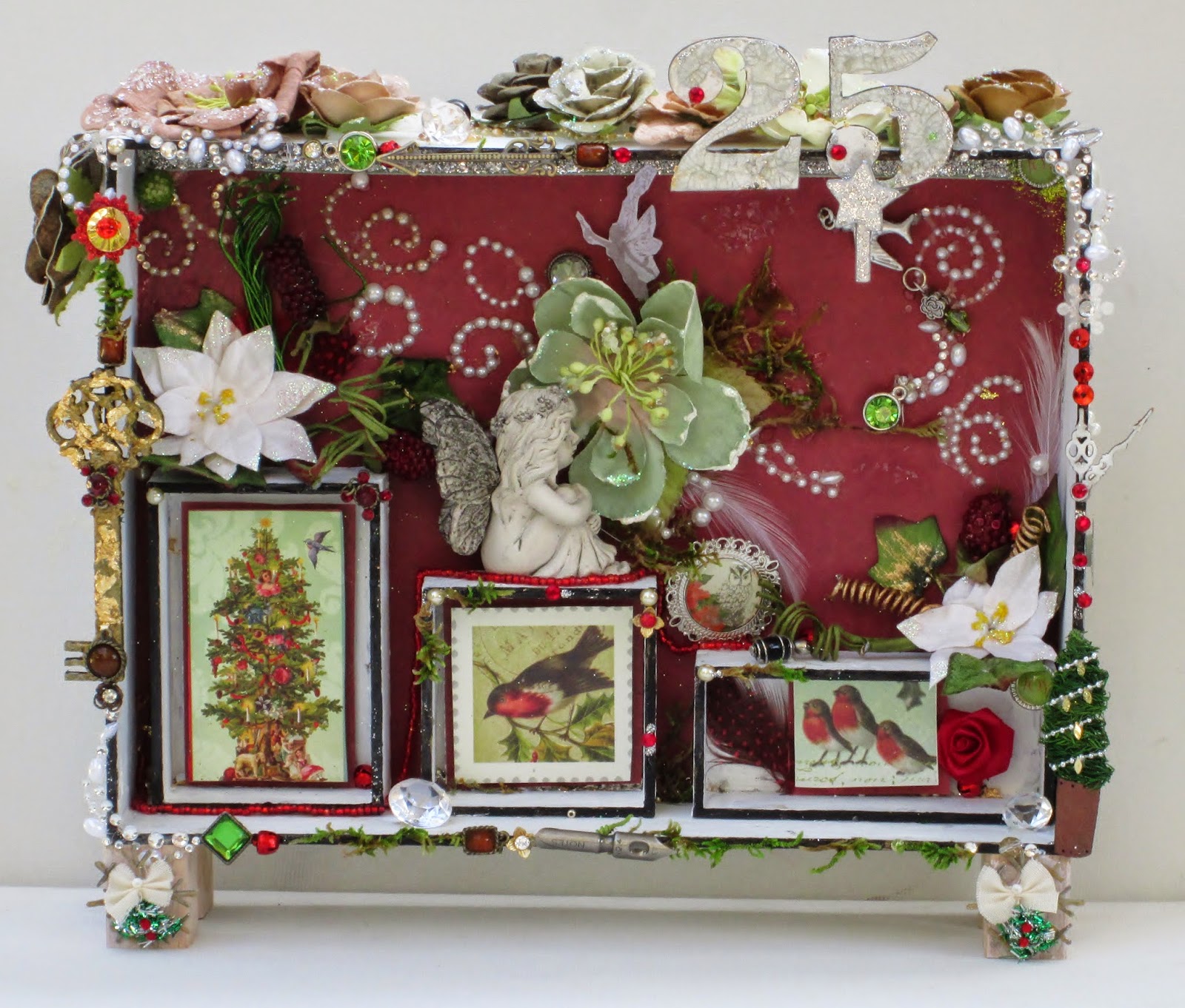
25

i everyone! Melissa here with my version of our composition box.  This heavy chipboard kit comes with 3 smaller boxes to assemble and place within (or on top of) the large box, a wooden key, and a number of your choice.  Create your own project in any theme you'd like, or choose a number to correlate with a special year or a special day.  Anything goes!  


To get the shiny gold effect I wanted on the key, I prepped it with gesso, then applied texture paste.  I then painted on some rub n buff, and some Pilot gold ink.  I also rubbed on some gold mica powder, applied glossy accents, then finished it off with some gold leaf in some areas.


Gina's Designs products used:
Composition Box

Other:
Paper by K and Company
Flowers by Prima and Petaloo
Stickers by Jolee's


Wednesday, August 20, 2014

Greenport


Hi everyone!  Melissa here with a 12 x 12 layout for Gina's Designs Lasercut Chipboard.

This is a photo of a beach in Greenport, on the North Shore of Long Island, New York.  Since it was taken in late September, I wanted to put a little Halloween in too.

 I first painted all the chipboard with gesso.  Then I painted on texture paste with a brush.  I only put a tiny bit on the sea horse.  I painted the chandelier with blue metallic acrylic paint, then glossy accents, then a little gold ink.  On the chains I painted on gold ink over silver glitter.  The flames have gold leaf on them.

 The crows were painted with black acrylic, then glossy accents, then gold mica powder and water.

  I went around the edges on a few of the pieces of chipboard with a black sharpie to make the colors stand out more.

The blue mermaid I painted with watercolors. I drew fish scales over blue paint on the dress, then put a little green gel pen on. To make the hair look like strands I scratched wet texture paste with a straight pin.  I painted the hair with gold mica powder and water, and followed that with a little purplish-blue mica powder.

On the green mermaid I put scales on by using a piece of netting and texture paste. I painted it with blue watercolor, then watered down green acrylic silk.  There is some green undiluted acrylic silk on the edges.  I rubbed in some gold mica powder on the whole surface.

The sand dollar I first painted with wet gold mica powder, then a little brown watercolor around the star part, to give a little definition.  I rubbed in pewter mica.  

The seahorse is brown watercolor. I added detail with a pencil, using a print of a seahorse as a guide.

Thanks for looking!


Chipboard used:


Other products used:

Jaquard mica powders
Glossy Accents
Butterfly by Reneabouquet
Winton and Lewis Watercolors
Stencil by Finnabair for Prima
DCWV paper,Travel
Swarovski flatback crystals
Tiny pieces of Vintaj
Jolees bling
Gloss Medium
Paper House Paper,Eastern Enchantment
Key Lime Acrylic Silk
Folk Art Metallic Periwinkle
Viva Modeling Cream in Pearl
Black Sharpie
Tsukineko Chalk Ink
Embossing powders in gold, jeweled gold , clear silver
tumbled glass Distressed glitter , glass glitter
Toho beads, microbeads, seed beads






Wednesday, August 13, 2014

Cards by Melissa for August Cross Promotional

Hi everyone! Melissa here with two cards.

It was wonderful working with these papers.  The details, images, and colors are crisp, and beautiful.  Vintage and romance, a perfect combination!

  I can always find just the chipboard I need to complement a theme at Gina's Designs.  The skeleton clock on the left I first painted with gesso, and then liquid pearls.  I put on a  little gold leaf,  and then silver ink.   On the right hand card I painted all three with gesso. On the corset I added detail with pencil, glossy accents, liquid pearls,silver stickles, and silver ink.  I laced it with black thread.

 The white heart at the bottom right has perfect pearls and glossy accents on it.  It's wrapped with metal thread I'm pretty sure is from the 1920's. It could be part of a rhinestone and metal cap.  My Mom found  a strand of rhinestones from it at a barn sale in Pennsylvania.  I've used all the rhinestones on other projects.

I put some perfect pearls on the gears.

The red heart charm is red watercolors over red metallic pen.  I put a dried flower from my yard on a layer of Dimensional Magic, then another layer of the glue on top. I added definition with a black sharpie. 

Thanks for looking!


Chipboard used:

Wooden Charm - Heart

Papers by Kitty's Scrap Post - Heart Break collection, and "Love struck" Bottle Cap Collage Sheet

Other products used:

Tim Holtz metal and stickers
Liquid Pearls
Swarovski crystals
Glossy accents
Dimensional Magic by Mod Podge
Swarovski flat back crystals
Glossy accents

Here are some close - ups.


Thursday, August 7, 2014

Gibson Girl

Hi everyone!  Melissa here with a mixed media layout using Gina's Designs Lasercuts.

This is a photo of Evelyn Nesbit from the early 1900's.  She was the model for the original Gibson Girl ,and was considered a cultural celebrity.  Her face and figure appeared everywhere; in newspapers, magazines,on souvenir items, and calendars.  She posed for many respected artists of her time, and acted on stage and film.

 Evelyn married a multi-millionaire, who later shot to death an ex- boyfriend of hers. The victim was another wealthy man, the famous architect Stanford White.   

 Using one of Gina's cardstock intricate doilies as a stencil, I applied texture paste on a 12x12 piece of black cardstock.  I then painted over both the paste, and the flat areas in between the raised areas, with turquoise Viva Color Precious Metal Effects.  To accentuate the dimensional effect, I brushed on some gold ink to the raised areas, and then outlined them with a black uni-ball pen.  I painted on some liquid pearls in green here and there.  With my finger I rubbed in some purple,blue, and silver mica powders all over.  I went over the black  pen with a little gold gel pen, and some silver ink.  I outlined the silver with some more black pen.

On the vintage boot at the lower left I dry brushed small amounts of gold lumiere paint over dry turquoise Viva Color.  I added more definition with a black sharpy on the edges. 

The skeleton clock at the lower left is liquid pearls over gesso .The turquoise bird to the left of the clock face is Viva color over gesso.  The purple bird at the top right is gesso,  purple metallic acrylic paint,  purple mica powder, and finally, glossy accents.  The scrolled  frame piece on the right edge is Viva color, in bands of purple and turquoise,with a little silver ink.

Thanks for looking!


Chipboard used:


Other products used:
Viva Colour Precious Metal Effect paint in turquoise
Jaquard Lumieres
Tim Holtz metal and ephemera
Butterfly by Reneabouquet
Jolee's Bling
Ranger Liquid Pearls
Jaquard Mica Powders
 Prima flower
Folk Art purple metallic acrylic paint 
Stickles in gold, diamond, silver
Crayola glitter
Swarovski crystals, flat back tanzanite
Time Traveler Memories brad by Prima
Clear Rock Candy Crackle by Ranger
Marvy Decocolor Paint Markers in gold and silver
Black Uni-Ball pen
Perfect Pearls in silver
Black Sharpie pen
Tsuineko chalk ink

I didn't care for the way plain black paper looked.  Below the butterfly I painted with some of the viva paint in turquoise. I rubbed on mica powder over it,then put a little crayola glitter on top.  

At the top right is an old broken ring of mine I got at Target.

 To the left of that is a necklace I got at a church bazaar . I knew I 'de use it for scrapping. I don't remember the name of the lady who made it.


At the bottom is part of a favorite shirt of mine.  It had one of these strings on either side that you tie into a bow at the back of the shirt.  I cut them off, I didn't want that look.


There are a lot of layers here of products.  I keep adding things until I like the way it looks.

Add caption
In direct sunlight to show bling and glitter.